Let’s explore 4 ways font styles can make or break your branding, especially in a luxury market.
Typography is often the unsung hero of branding. Logo designs and color palettes usually take all the glory, while font styling ends up being an after-thought. However, it doesn’t take long to notice this gap in your branding assets and feel it’s keen sting. This article explores 4 areas where typography can make or break your brand look and feel, particularly in a luxury market.
Before we go further, keep in mind: “Luxury” can be a vague term, meaning different things to different people. Luxury doesn’t have to mean exclusive or expensive. In my opinion, if you’re a small business owner and want to confidently charge what you believe your products and services are worth and reach an audience willing to pay for it above a cheaper alternative, you have an aspiring luxury brand.
Luxury brands are those that value the little things. The little extras that make for an above-average customer experience. The extra love and care that goes into a high-quality product or service. And yes, the little details that go along with thoughtful branding, like typography. Let’s dive in!

#1 – Font Styles within your Typography Hierarchy
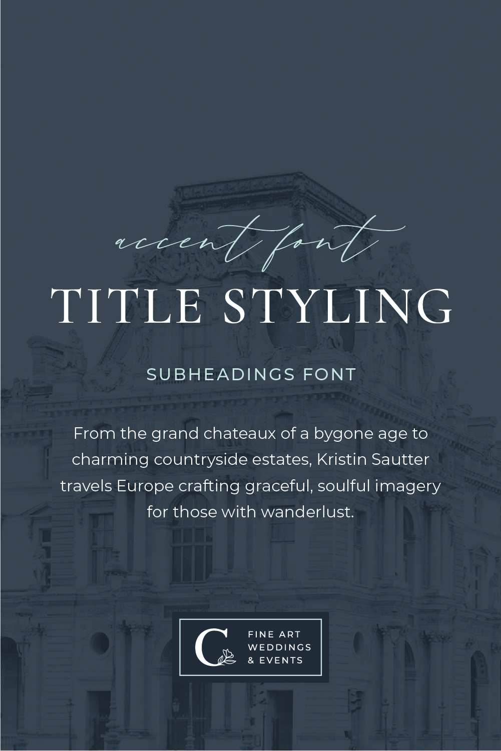
A typography hierarchy means having a consistent set of complementary font styles that you use throughout your branding design. This is typically 3-4 well-chosen fonts that you use for titles, headings, subheadings, and paragraph styles. Having a typography hierarchy in place makes your brand materials easier to create (win for you) and consume (win for your audience). This is especially true for websites and sales pages as it makes them easier to skim.
Without a typography hierarchy as part of your complete branding package, you risk a) losing time on creating marketing graphics and b) undermining the trust of your audience when your brand appears inconsistent. Let’s break it down.
The moment you open up a platform like Canva to start creating additional brand collateral (like social media graphics), you’ll suddenly find yourself lost in a sea of serifs. So many font styles to choose from. Does this match my brand? Does this font combination work together? Watch the questions roll in (and the hours fly by) when you don’t have a typography hierarchy in place for your brand.
Secondly, consistency in design builds trust. Just today, I opened up an email newsletter from an artist I follow and had to scroll back up to see who it was from. The look had completely changed and, in an instant, I forgot who was speaking to me. The same thing happens when you are constantly changing up fonts, colors, you name it. This subtly undermines that trust you are working so hard to build. One of the many reasons why a consistent, cohesive brand identity is so important, font styles and all.
#2 – Premium Fonts vs. Free Fonts
One of the easiest ways to set your brand design apart is by using a premium font. A premium font refers to one that requires a purchased license to use for your business. This is usually not the budget-breaking expense people think it is. Desktop licenses are usually between $25-$50 as a one-time fee. A separate license to use on your website can run about the same amount, though occasionally these are an annual fee rather than a one-off purchase.
I know what you’re thinking – are premium fonts really worth it? In my experience, YES! Can you build a business using only free fonts? Absolutely. However, you run the risk of looking like everyone else, because everyone wants to use the free fonts!
Remember, your typography hierarchy consists of 3-4 font styles. Even choosing one premium font and pairing it with other free fonts can help your brand stand out. This is usually my recommendation as a brand designer. I’ll look for 1-2 premium fonts that really align with the brand strategy (more on that in a bit), and then supplement the rest of the type hierarchy with free fonts.
Stylish title and script fonts are the most difficult to find as a free font. The best ones are sorely overused. A few of my favorite luxury font designers are Jen Wagner and Blanc Salvage (use my affiliate coupon code THECREATIVEACCENT for a 15% discount on anything that catches your eye!).

#3 – Font styles that actually align with your brand
Just like choosing brand colors, patterns, and other brand assets, your typography should align with the overall strategic look and feel of your branding. Being able to identity the right fonts stems from establishing a clear creative direction and an intentional brand strategy. Here are a few examples:
Tempo – Font styles often convey a certain tempo. Condensed fonts feel fast-paced, giving the viewer a sense of energy and even urgency. In the same way, fonts in all-caps bring more energy than ones in lowercase. This works well for a high-energy brand, but is less effective (and even counterintuitive) for the brand that wants to communicate peace and relaxation.
Timeless vs Contemporary – Fonts can also appeal to a certain demographic, while repelling others. Most serif fonts have a certain timeless quality that make a good fit for wedding professionals, venues, and brands that want to communicate a long-standing legacy. On the other hand, sans serif fonts tend feel more modern.
Exclusivity – Some fonts and font combinations can make a brand look more or less exclusive. By exclusive, I’m referring to the high-end corner of the market. Unique display fonts or those with a sharpness or ultra-fine lines can make a brand look exclusive. By contrast, softer, rounded fonts will feel more approachable and down-to-earth.
#4 – White space and breathability around your typography
Extra white space within a design (including around fonts) not only makes everything more legible, but it also instantly elevates your brand. Just like the font styles themselves, including more or less white space determines the energy and tempo your brand communicates to the outside world. For example, less white space can feel more cluttered and hurried, whereas more white space feels more relaxed and sophisticated.
This point doesn’t necessarily pertain to the fonts themselves, but rather how they are used. You can have the most beautiful font combinations, but if they are running on top of each other and other design elements, your branding will NOT communicate the luxury feel that you desire. Your font styles are just as much art within your branding as an illustration or pattern, so give them room to shine!

Choosing the right font styles to elevate your brand
Designing a cohesive brand identity is an intricate process. It encompasses many elements, including typography, that all come together to form a clear impression in the mind of your audience. What do you want your audience to feel when they encounter your branding? What should this collect design unit communicate about your business?
While this article speaks specifically to the power of typography, it’s just one piece of the branding puzzle. If you’re looking to elevate your branding, consider one of our design services:
- Brand Strategy – A 1:1 strategy intensive to gain more clarity about your brand messaging and to define a creative direction that aligns with your goals
- Custom Brand Design – Our premium all-in-one service to craft a custom brand identity that resonates with who you are and is ready to attract your ideal clients
- Shop Brand Kits – Looking for a faster, more budget-friendly alternative? Our semi-custom brand kits include all the brand assets (including a type hierarchy!) that you need for a professional, cohesive brand identity.
