Learn how this mortgage broker logo redesign actually started as a request to win time with their social media marketing.
“Thank you for not just doing what we asked, but for giving us what we needed.”
These kind words from Paul and Nishka, the Canadian-based mortgage experts behind Nishka Riley Mortgage Team, continue to touch my heart. What started as a desire to win time on their social media marketing with Canva templates, quickly became a need to revisit their branding at its core.
What they thought the problem was
Nishka and Paul initially came to me because they were tired of spending hours on every Instagram post. They wanted to grow their reach on social media, but the demand on their time left them looking for solutions to streamline the process. With that in mind, they contacted me to create a series of plug-and-play Canva templates for Instagram and Pinterest.
the real problem
True – creating social media graphics was taking up too much time. But why? After our first conversation, it became clear that the real problem they were struggling with was two-fold. First and foremost, they didn’t feel connected to their existing brand styling anymore. This was especially true for the color palette, which they were reluctant to use in their social media marketing.
Secondly, their former branding (created well over a decade ago) didn’t include any sort of typography hierarchy. Simply put – there were no guidelines on which fonts to use or how to use them.
This combination led Nishka and Paul to unknowingly try to redefine their “look and feel” with every post. Constantly trying out different colors, layouts, and fonts was consuming all their marketing efforts.


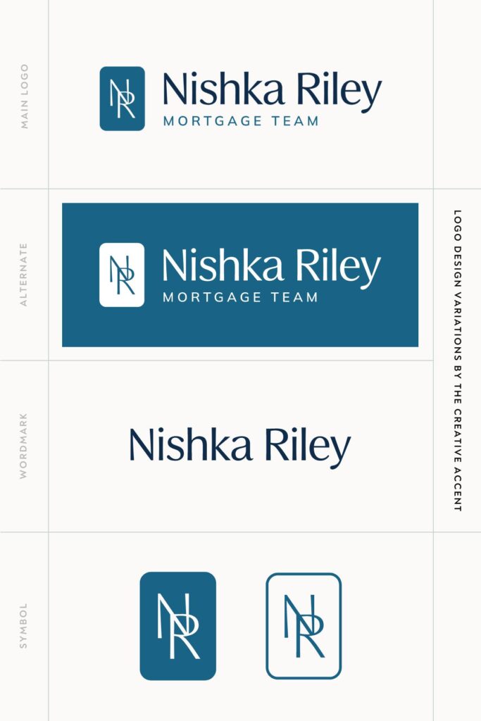
Nishka Riley Mortgage Broker Logo Redesign
the solution
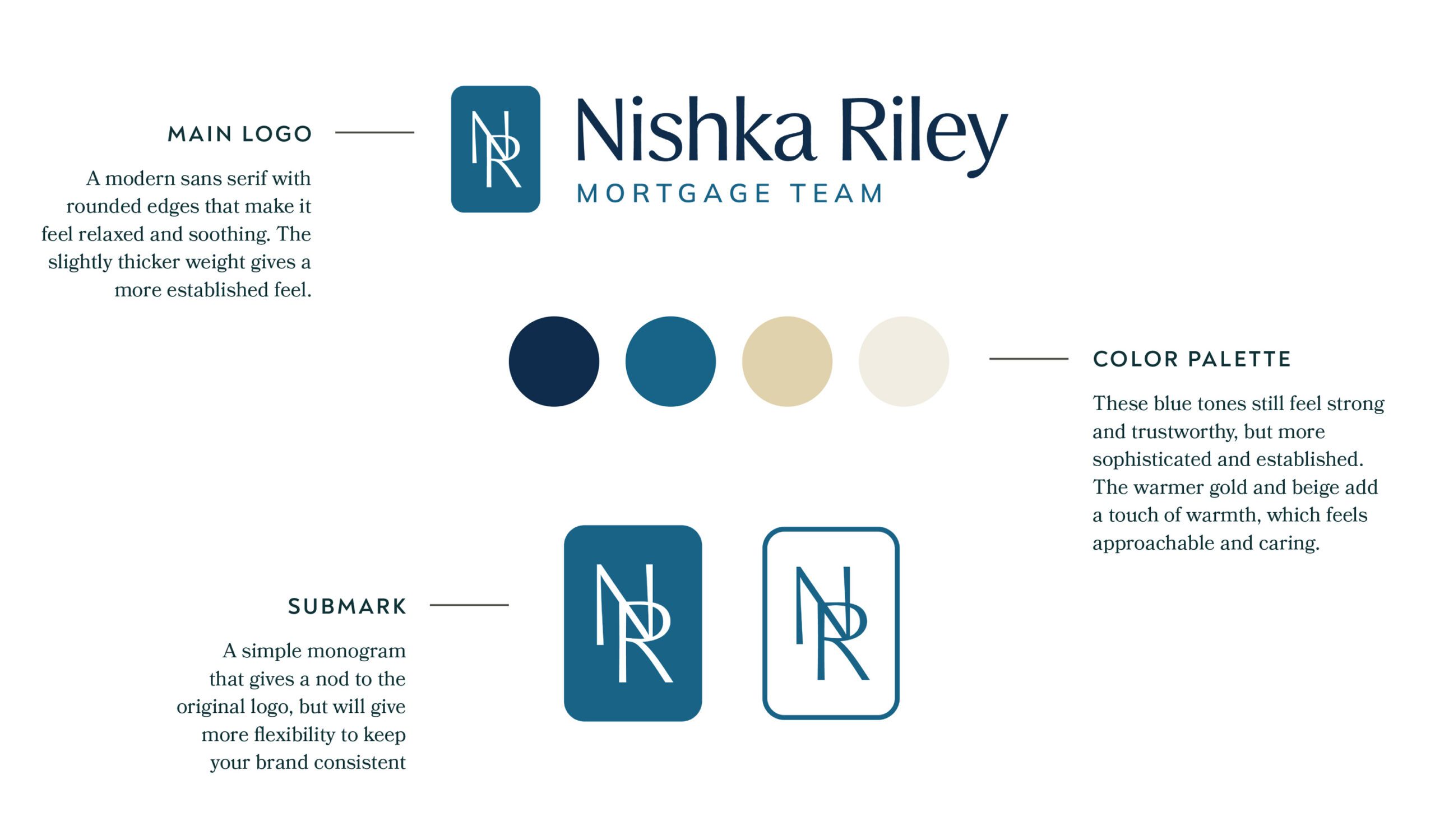
It was time to refresh the outdated logo and color palette that no longer resonated with their brand and establish clear brand guidelines. Was this a complete brand overhaul? Yes and no. The fact was, Nishka’s target audience and positioning hadn’t changed, but her brand had matured. They wanted to move away from the corporate look and give their branding a more refined, personal touch. In particular, Nishka’s warm, kind personality was completely missing from their existing look and feel. Below are a few of the key influences behind the design decisions:
Old Logo

New Logo


“We’ve worked with a couple of designers in the past, but Carrie has been the best by far. She breathed new life into our branding without making it a startling shift for our existing clients.”
– Nishka Riley
How do you know when a logo redesign is right for your business?
Nishka and Paul had that intuitive feeling that something was off with their branding. This is one of the 5 tell-tale signs your brand could use a refresh. Without clear guidelines in place and a brand you love, it’s normal to go looking for the right pieces of the puzzle to fill that gap. However, this so often leads to hours of frustration fumbling through font styles and color palettes. Not to mention, inconsistent branding runs the risk of undermining trust with your potential clients.
If something feels off with your brand, or you find that social media marketing is taking way longer than it should, it may be time to refresh your branding. Learn more about my Signature Brand Design Experience – the done-for-you branding solution to turn the ideas you have in your head into reality.
