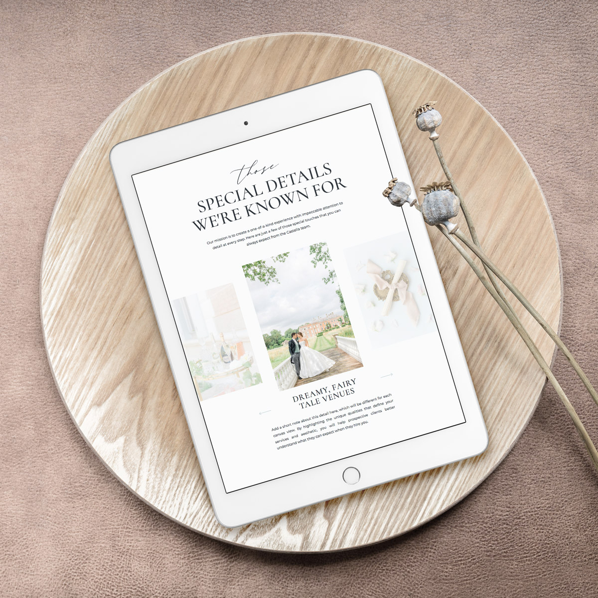
Discovering the Showit website builder has been nothing short of transformational in my business, both in terms of managing my own site and offering website design services. Since starting as a creative entrepreneur in 2011, the question came up a lot…
Why don’t you design websites?
My answer was a resounding NO every time. Why? Because I had ZERO interest in learning code. I wanted to draw and paint, design brand identities, and create amazing color palettes. I definitely did not want to learn how to code websites.
Enter Showit: the no-code website builder
After realizing that an Etsy shop alone wasn’t going to cut it and having someone else completely manage my website was impractical, I went searching for solutions. That’s when I discovered Showit, a simple, no-code website platform and creative’s dream. In fact, I enjoy working with it so much that I decided to not only venture into designing custom websites, but have recently opened up a website template shop as well.
Why do I love designing on Showit so much? I thought you’d never ask!
14 reasons to fall in love with the Showit website builder
#1 – It’s a drag and drop platform
This is what caught my attention in the first place – no code required! The Showit website builder is very intuitive and gives so much creative freedom. Simply click and drag to move things around, resize text boxes and photos, and align elements.
In fact, you even use keyboard shortcuts (like Ctrl+Z or Cmd+Z to undo). Easily copy and paste design elements, text boxes, whole pages and more.
#2 – Excellent customer service
As with any new program, there is a learning curve. But Showit’s live chat within the design app and extensive library of help documents make this so much easier. Their support team is quick to respond and always friendly. They also have a very active Facebook group for additional support from the community of designers.
#3 – Easy to keep your branding consistent
Showit’s design settings allow you to add up to 8 brand colors and set your font styling for titles, headings, subheadings and paragraph text. This helps keep your branding consistent throughout your website. It also enables you to make universal changes if you decide to refresh your brand color palette or use a different font later on. Speaking of fonts, you can also upload .woff files for custom fonts (with the appropriate web license of course) or add free Google fonts right inside the platform.
#4 – New frame features
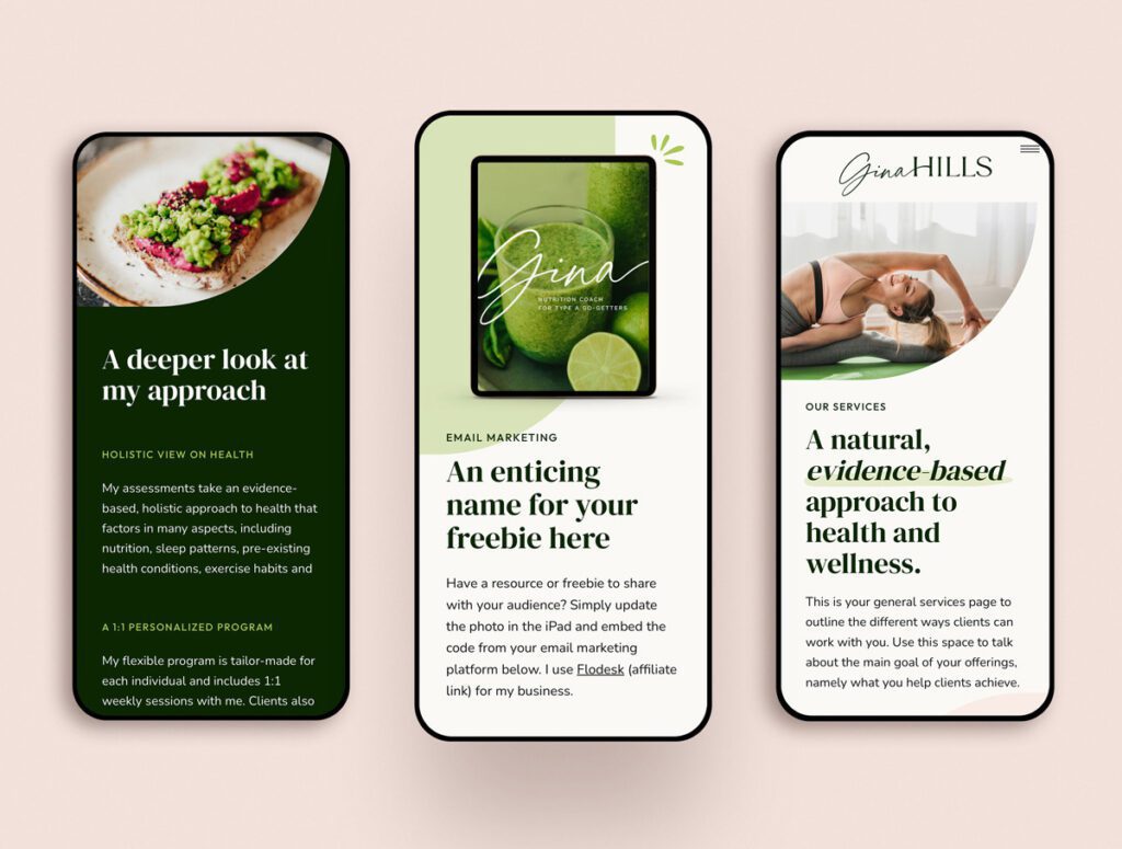
Being the flexible, creative platform that it is, Showit has expanded the options for framing your photos. Now you can create fun, customizable frames that can really make your site stand out. From rounded corners to beautiful arches, you can add your own unique styling to both frames and colored shapes. See below for an example of this frame styling in action.
#5 – Site Canvases
Site canvases are perfect for sections of your website that you’ll use on multiple pages, such as the header, footer, and mobile navigation menus. I often use site canvases for lead magnets, FAQ sections, and testimonials as well. You can convert any canvas into a site canvas. Why is this so valuable? Because if you need to make a change (such as adding a new page link to your menu), you only have to make this change once and it will apply it to the whole site. More about using site canvases here.
#6 – Canvas Views
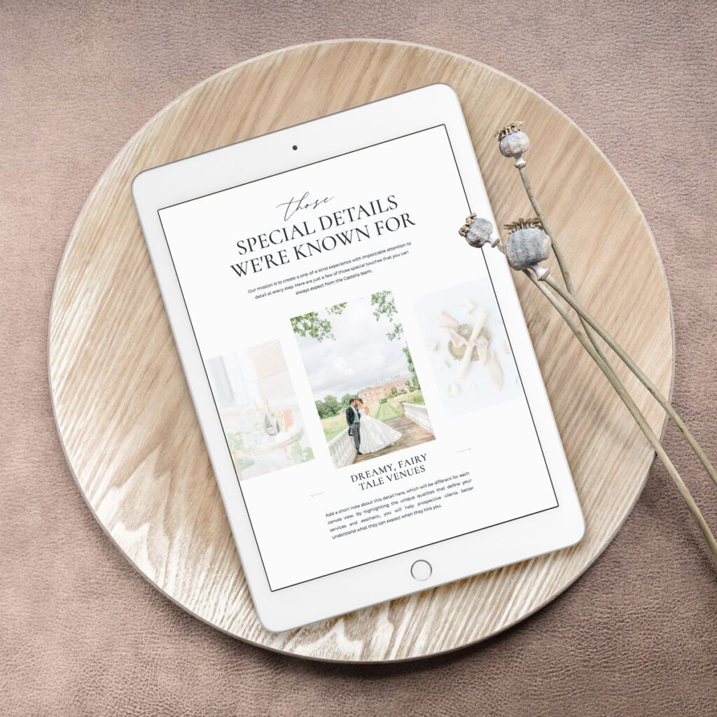
Quite possibly my favorite way to make a website interactive and engaging. Canvas views allow you to hide certain details and invite the user to click to reveal them. This is perfect for a carousel of testimonials or outlining your process one step at a time. This feature allows you to include a lot of detail and information without showing it all at once, which helps your site feel less overwhelming and more inviting to read. More about canvas views here.
#7 – Transitions
Transitions are settings that will indicate elements will appear as the user scrolls your site. From luxury websites that are unveiled gracefully to fun, playful sliding elements, transitions can add a sense of movement to your site. If you’ve purchased a Showit website template, these will probably already be set up for you.
#8 – Mobile v. Desktop layouts
The mobile experience of a website is completely different than viewing it on a desktop computer. Since traffic is coming from a variety of devices, it’s more important than ever for a website to be responsive to (aka: look good on) multiple devices. One of the beautiful things about Showit is it’s ability to customize the mobile and desktop layouts individually. Choose different background photos for the same canvas (vertical for mobile, landscape for desktop). Hide elements that look great on desktop but feel overwhelming on mobile.
In other words, you can customize the client journey for both. It requires a bit more work, but it’s well worth it! And if you really don’t have time to optimize your mobile layout, you can hand it over to me on a VIP Day!
#9 – Easy Integrations
You can easily integrate the necessary tools for a smooth workflow right inside Showit, from Dubsado and Flodesk forms to YouTube videos and more. Even as I type, I’m using the WordPress blog integration with my Showit website. Need e-commerce functionality? No problem. You can integrate PayPal buttons, Shopify Starter, WooCommerce and more.
#10 – Options to customize with code
I know, I know. Code is what I wanted to avoid in the first place. Even though it’s a no-code platform, it is still possible to add it in for special features, such as rotating text and hover drop-down menus. Showit makes this super easy with a simple embed form that you can add to any page.
#11 – Personalize with custom icons
I’m loving this feature so much! Showit already has a lot of icons ready to drop onto any page. These include icons for social media platforms, arrows, shapes, and more. But in addition to this, you can also create custom icons for your website. I’ve included a set of custom icons in the Gina Hills template (shown below). Like other icons inside Showit, you can easily change the colors and resize custom icons as well.

#12 – SEO Tools
No one wants their website to be all pretty and no power! Make use of Showit’s built in SEO tools to improve your site’s ranking and visibility. Add SEO settings for each page, including the page title, meta description and a photo. Help search engines better understand the content on your site by properly setting your text tags. Optimize your website images by filling out an appropriate SEO title and description.
#13 – Give contributor access to your designer
If you’ve chosen to work with a designer, you can easily add them as a contributor to your website. This will enable them to come in and make requested changes without giving access to your login details or account information. Perfect if you’re working with a designer on an on-going basis or a VIP Day. Contributor access can be paused or revoked at any time in your account settings.
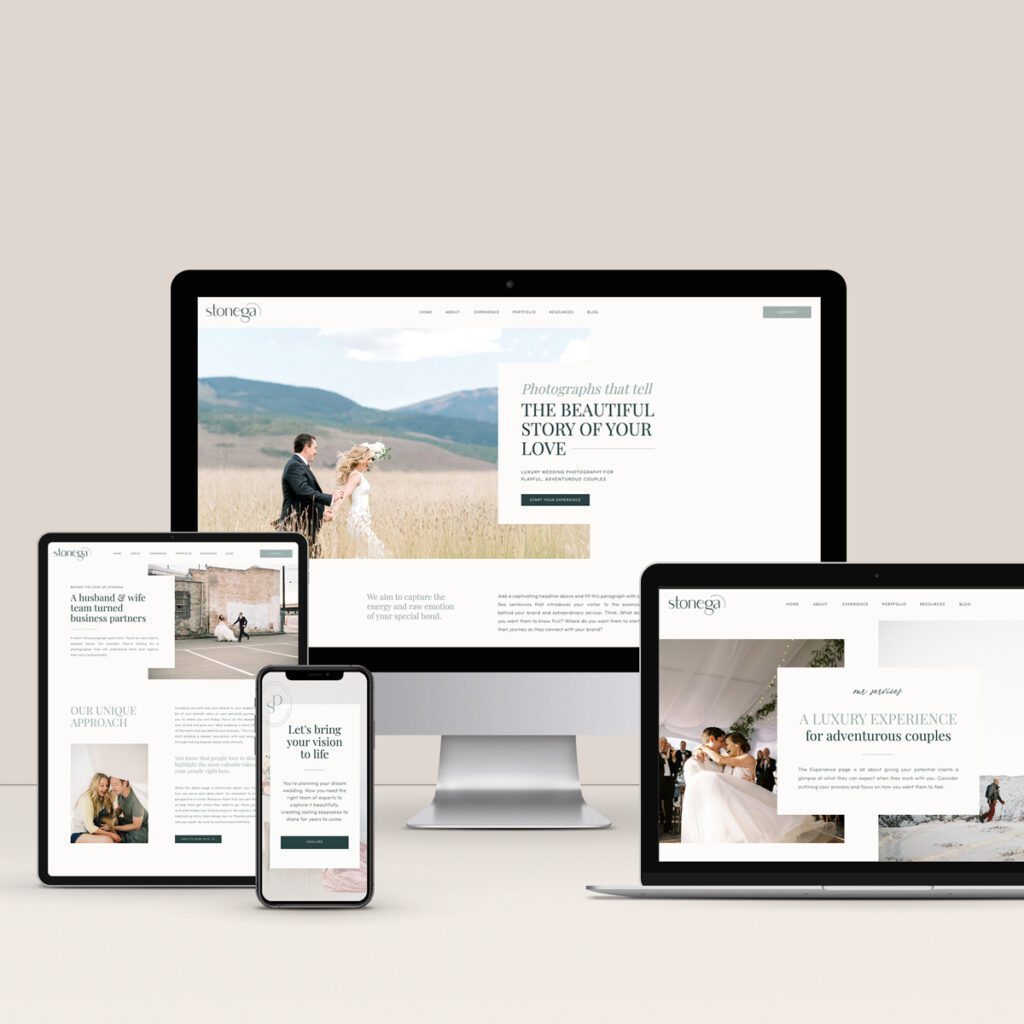
#14 – So many website templates to choose from!
Seriously, DIY-ing your website has never been easier. There are so many gorgeous website templates out there in a variety of styles. All you need to do is plug in your photos, text and you’ll have a beautiful website up and running in no time! Visit The Creative Accent Template Shop to browse our own collection!
Conclusion
Trying to find the best website platform for your business can be a daunting task. In my opinion, the creative freedom you get on Showit is unmatched by other website platforms, making this the ideal platform for service providers, personal brands, and creative entrepreneurs. If you haven’t already tried this amazing business tool, use this (affiliate) link to start your free 14 day trial.
