Choosing your brand colors is a combination of strategy and intuition. It’s like a recipe with endless possibilities to make it unique to your business. While the right color palette is only one piece of the branding puzzle, it is an important one. Why? Because colors have a special ability to evoke emotions. They make us feel something, communicating so much faster than words.
What we’ll cover in this post:
- Strategic side of choosing brand colors
- Intuitive side of choosing brand colors
- How many brand colors to choose
- Finding inspiration
The strategic side of choosing brand colors
The importance of strategy cannot be overstated when it comes to making intentional design decisions. So while this article focuses on color, the strategic points discussed here will apply to all aspects of brand messaging and design (logo design, typography, etc.). That’s why my brand design services include an in-depth strategy workshop. This not only helps me better understand the business, but often leads to intriguing insights for the business owner as well. These insights revolve around 3 main areas: the brand’s foundation, ideal clients, and position in the market.
Defining your brand foundation
Laying this foundation is an integral part of understanding the essence of your business. Think of it as the why behind why you do what you do. Your brand foundation includes your purpose, vision, mission statement and core values. In particular, I find that identifying your core values contributes significantly to pinpointing the right colors for your brand.
For example, if being trustworthy ranks high on your list of core values, you might consider blue for one of your main brand colors. Blue is traditionally known as a calming, dependable color that conveys a sense of clarity, organization, and intelligence. On the other hand, if you want your brand to be known for its unwavering optimism and positivity, then you might consider an energizing yellow as part of your color palette.
A few key questions to answer…
- What do you value?
- What’s fundamental about how you do business?
Understanding your audience and what attracts them
The next strategic pillar is understanding the customers you want to reach and how to connect with them. You want to have a clear vision on their lifestyle, values, desires and struggles. Are they Type A go-getters or do they resonate with a more chill vibe? How do your products and services tie into their desires and what they hope to achieve in life (or business)?
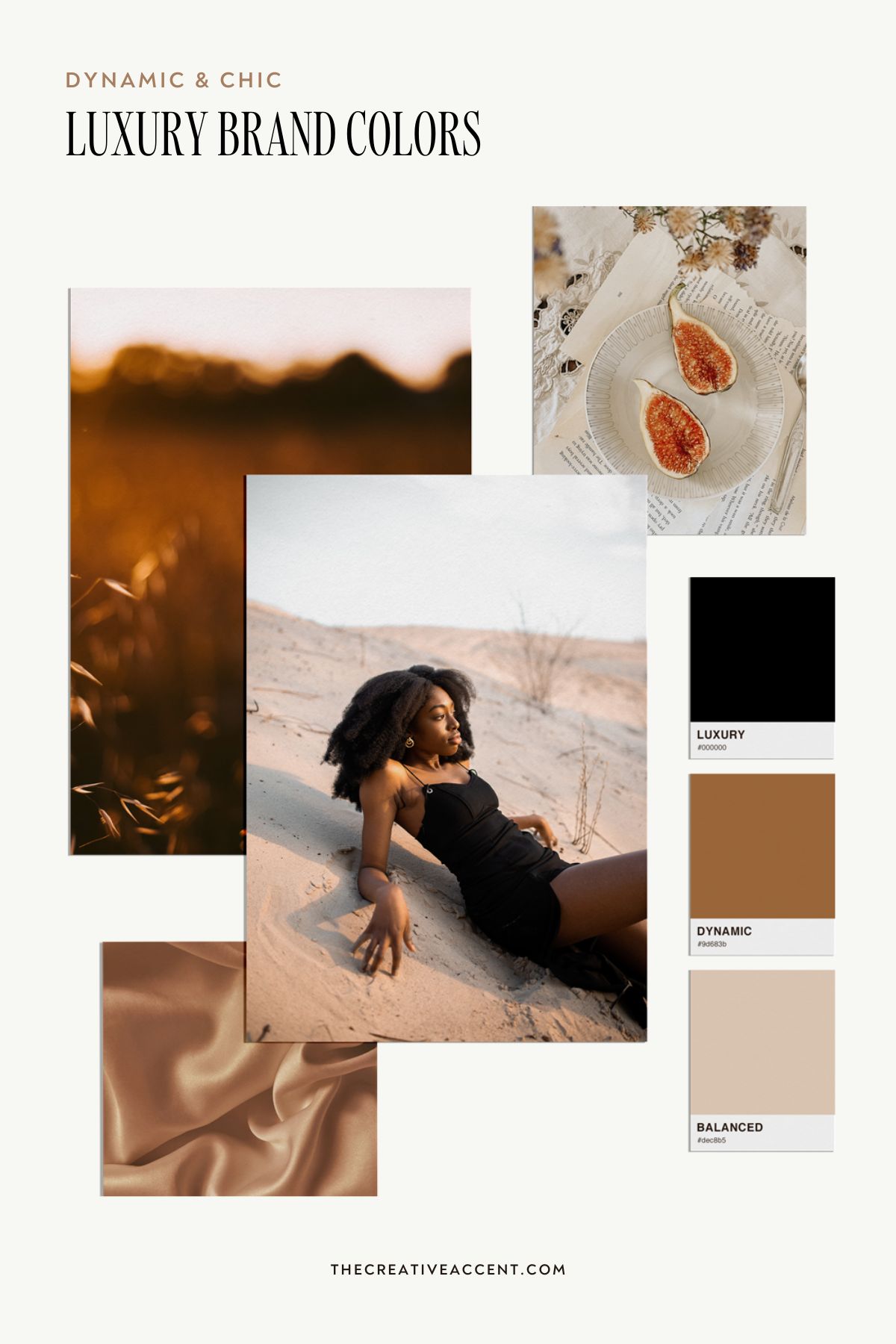
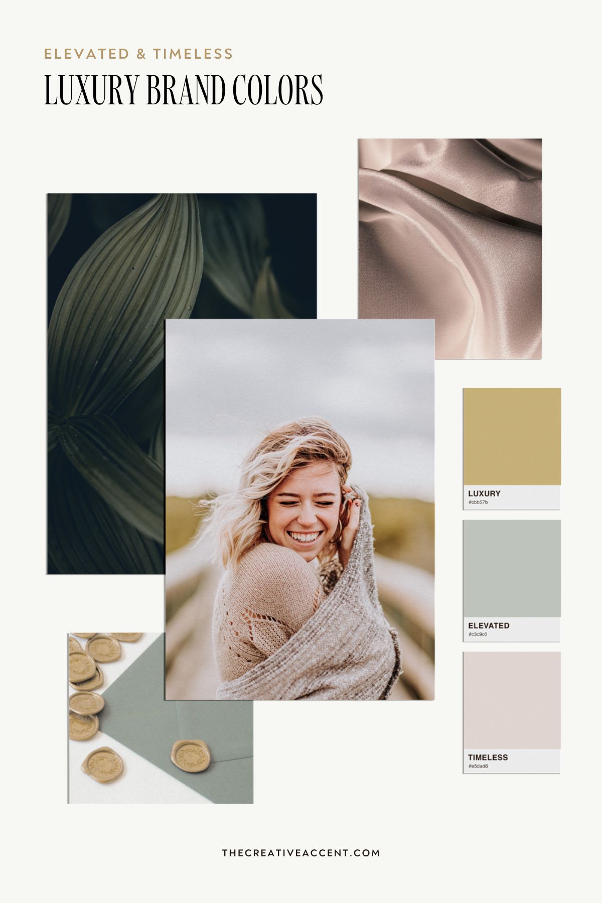
Let’s look at an example. Say a brand wants to attract the high-end clients in a particular industry. To decide on effective brand colors (along with a hundred other decisions to build a strategic brand) will require more digging than simply going for “the luxury client”. First, they’ll need to define exactly what luxury means. Because those are the clients willing to pay more? Why are they willing to pay more? Is it primarily because they value quality, crave a lavish experience, live to impress, or see the investment as a form of self-care?
These types of questions and more will help you better understand what your ideal client will be attracted to and why. Take the two moodboards and color palettes below. Both are built to draw in a luxury market, but take a very different approach. On the left, the vibe is bold, dynamic, high contrast and modern. On the right, the mood is much more relaxed, timeless and focused on quality.
Market position
The third pillar we’ll look at is your brand’s position in the market. It’s important to research your competitors in a healthy way. Look at the dominant colors they are using in their branding and, as the not-so-old saying goes: When everyone zigs, you zag.
Researching the competition can help you identify ways to stand out in the market. What’s especially important is to uncover what sets you apart and look for ways to bring that out in your branding (also in your colors!). For example, an organic brand may choose a bolder, more saturated palette to stand out from top competitors who have neutral, earthy brand colors.
So if your biggest competitors are using mostly cool color palettes (blues, greens, grays), consider differentiating yourself with warmer colors such as yellow, orange, pink or red. Just be sure that this kind of “zag” also aligns with the other aspects of your brand strategy.
The intuitive side of choosing brand colors
While strategy is certainly a key player in the brand design game, I’m a big believer in the intuitive side of designing as well. As stated at the beginning of this article, colors make us feel something. So I can only conclude that feelings have a seat at the table when it comes to choosing brand colors.
Is intuition the same as personal preference? Not exactly. Personal preferences will inevitably influence design decisions to an extent, especially with personal brands. Intuition plays a greater role in more subtle nuances, such as choosing just the right shade of pink, or putting together different colors to build a harmonious palette that aligns with the brand message.
Even when all the colors are technically “right” according to the rules of color psychology, intuition can step in and signal when a particular shade doesn’t vibe with the rest, or the combination together creates a different feeling than all the colors individually. This is where the beauty of each unique brand really starts to shine.
How many brand colors should you choose?
Your brand color palette should be versatile enough to cover all your potential needs, but still stay consistent. This is important for making your brand more recognizable, which in turn builds trust with your audience. I generally recommend 2-3 main colors that will be used most often, paired with 4-5 complementary colors to complete the palette. Within this mix of 6-8 brand colors, consider including:
- at least 1 dark color for body text and dark backgrounds
- 1-2 light neutrals for backgrounds and soft accents
- at least 1 color that’s your go-to accent color and grabs a bit of attention
When choosing a dark color for the palette, many businesses default to pure black. However, this isn’t the best option for every business. Pure black is a bold color that creates impact and a bit of drama, qualities which may or may not fit your brand strategy. Consider alternatives such as very dark shades of gray, brown, blue, green and even purple instead.
In the example below, we used a very dark green and an empowering pink to create the desired impact without losing the sense of connection and approachability that was so important to BSwell’s strategy.
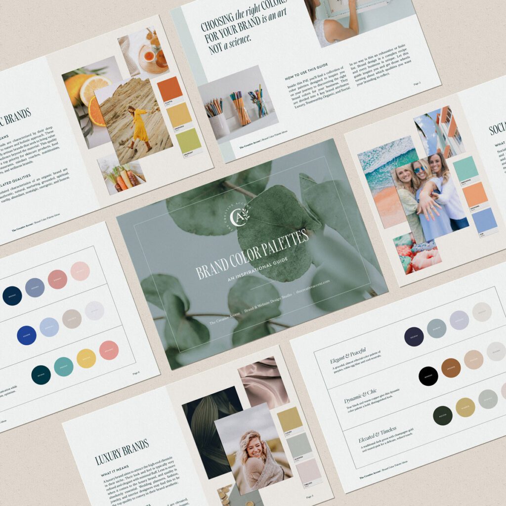
Find inspiring color palette ideas for your brand!
Colors will either support your brand message or undermine it. They are just too impactful to not be significant in your overall brand strategy. If you’ve decided to DIY your own branding rather than work with a brand designer, you’re probably on the hunt for the right color palette for your business. Look for inspiration to spark your creativity!
Inspiration can be found in a variety of places, from Pinterest and magazines to simply being outside in nature. To help you on your journey, I’ve put together a free guide of inspiring color combinations. Download this free Pdf below and discover inspiring color palette ideas for your brand!