
Brand colors psychology and what it can communicate about your business
Understanding color psychology and how to choose the right colors for your business is one of the most important (and fun!) aspects of brand design. Being the powerful non-verbal communicators they are, colors can quickly evoke emotions, reflect your brand’s personality, built trust through recognition, and ultimately create a vibe around your brand. Whether you are starting a new business or refreshing an existing one, understanding the impact of brand colors is more than aesthetics and personal preferences–it’s an essential part of the branding strategy.
The question is whether or not your brand colors are actually solidifying your message. Are they creating the RIGHT vibe and emotions, or are you sending mixed signals to your audience? Let’s find out!
This article explores the psychology behind each color and what it means for your brand. This understanding, along with the resources outlined here, will help you make informed decisions when putting together a color palette for your business.
Need help translating your vision into a cohesive, meaningful color palette for your business? Our Brand Strategy Consulting services are designed to help you break free from the distraction and confusion that’s holding you back from building the brand of your dreams!
A practical note about brand color psychology
Before we dive into the individual colors and their meanings, it’s important to note that choosing the right colors for your brand is an art and not a science. There isn’t always one absolute right answer. Your business needs to communicate different qualities, which is where putting together a harmonious color palette comes into play rather than fixating on only one color.
It’s also important to keep in mind that other factors can influence the perception of brand colors beyond the generally-accepted color psychology practices discussed here. Cultural norms, industry expectations, a color’s unique shade, tint, tone and saturation level can all influence the way a specific color is perceived.
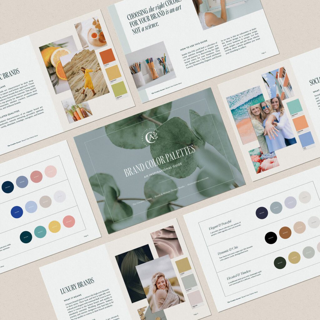
Looking for brand color palette inspiration?
Grab our free color palette guide and discover inspiring color combination ideas for your business!
Warm, Energizing Colors
Let’s start with the hues typically associated with warm colors: Red, Orange, Yellow, and Pink. These are energizing colors that all express a sense of joy and confidence. Warm colors grab your attention in a special way, just like they do in nature. Think of the vibrant red in a strawberry or the color of an orange popping out against a backdrop of green. It draws in the eye. Including a warm color in your palette can help your brand feel more engaging and, dare I say, compelling.
Red
Red is a bold, stimulating color. It conveys a sense of determination and drive, which makes it a good choice if your business has a real go-getter persona. A highly saturated red feels strong, fiery and energized, whereas a deeper red with some black mixed in (think maroon or marsala) feels more grounded.
Orange
Orange is a delightfully engaging color that evokes a sense of creativity and zeal. A blend of red and yellow, the color psychology behind orange varies depending on the unique hue. An orange where red is more dominant (think sienna or burnt orange) feels more powerful and assertive, but a softer peach or marigold gives a more relaxed and cheerful impression.
Yellow
Spontaneous and friendly, yellow evokes feelings of optimism, playfulness and even awareness. Yellow often makes a good supporting color in branding because it can brighten up and add warmth to an otherwise cool palette. Yellow is also often expressed in a variety of gold tones, symbolizing wisdom, wealth, and generosity. You’ll need to get crafty though if you plan to use a bright or pale yellow as a dominant color in your logo as the lack of contrast can make legibility an issue.
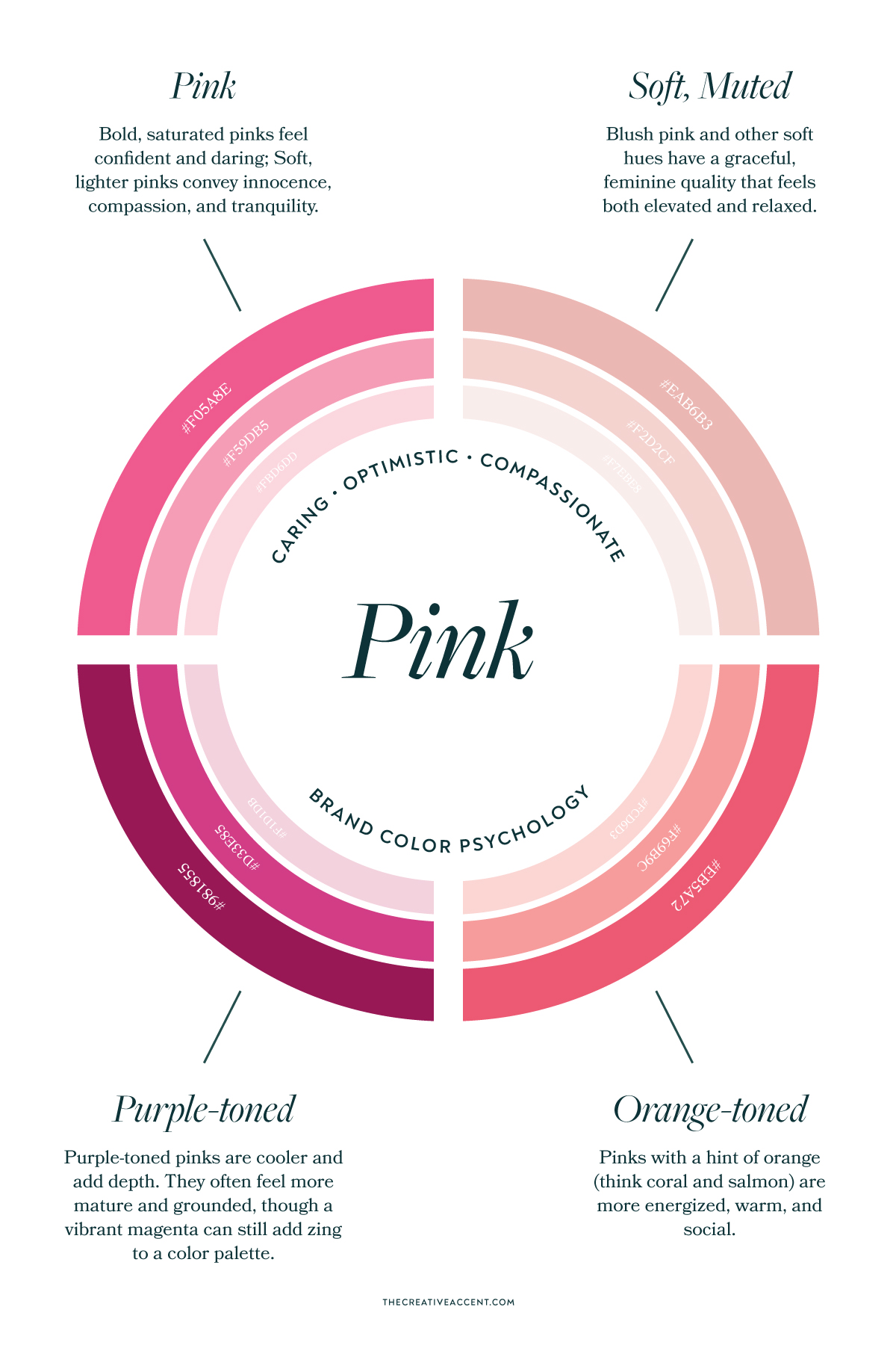
Pink
Pink can fluctuate between soft and romantic to bold and empowering, depending on its particular saturation and tone. Generally considered a nurturing color, pink conveys a sense of compassion, innocence, and femininity. Though, is it really a feminine color?
Bringing with it a politically and culturally-charged history, pink is certainly one of the most controversial colors of our day. Since the 1940s, marketing efforts have pushed the association of femininity with the color pink. Several studies have claimed that certain shades of pink have a tranquilizing effect and can even make you physically weaker. Whereas other historical accounts claim that pink was considered a masculine color because of its close connection to the strong, assertive qualities of red.
Calming Cool Colors
Next let’s explore the reflective, calming qualities of the cool colors: Purple, Blue, Teal, and Green. These hues typically run at a slower pace than their warm counterparts. They can bring a sense of order and balance to a brand’s color palette, and often feel more introverted and dependable.
Purple
Purple has a mysterious, spiritual quality that is often associated with royalty and luxury. Of course, like all the colors, purple brings with it a wide range of emotions depending on the hue. A soft lavender will feel serene, almost etherial, while a deeper eggplant leaves a stronger, dynamic impact. Purple is a blend of blue and red so it can incorporate characteristics of each. Purples with more blue are cooler, conveying more clear and communicative qualities. Red-infused purples will bring a bit more warmth and drive.
Blue
A favorite among brands, blue has a soothing quality that conveys a sense of trustworthiness and logic. Blue is an excellent color for businesses whose audience expects a high level of professionalism and dependability, such as accountants, dentists, and consultants. On the flip side, blue can also feel too cold and aloof. If your brand strategy requires a certain approachable or social quality, consider pairing blue with a warm color.
Green
Deeply connected to nature, the color green evokes a sense of abundant life, harmony, and strength. Greens with strong blue undertones will feel more soothing and restorative, while those on the yellow side will feel friendlier and engaging. Because of its balancing effect, green is an easy color to incorporate into your branding.
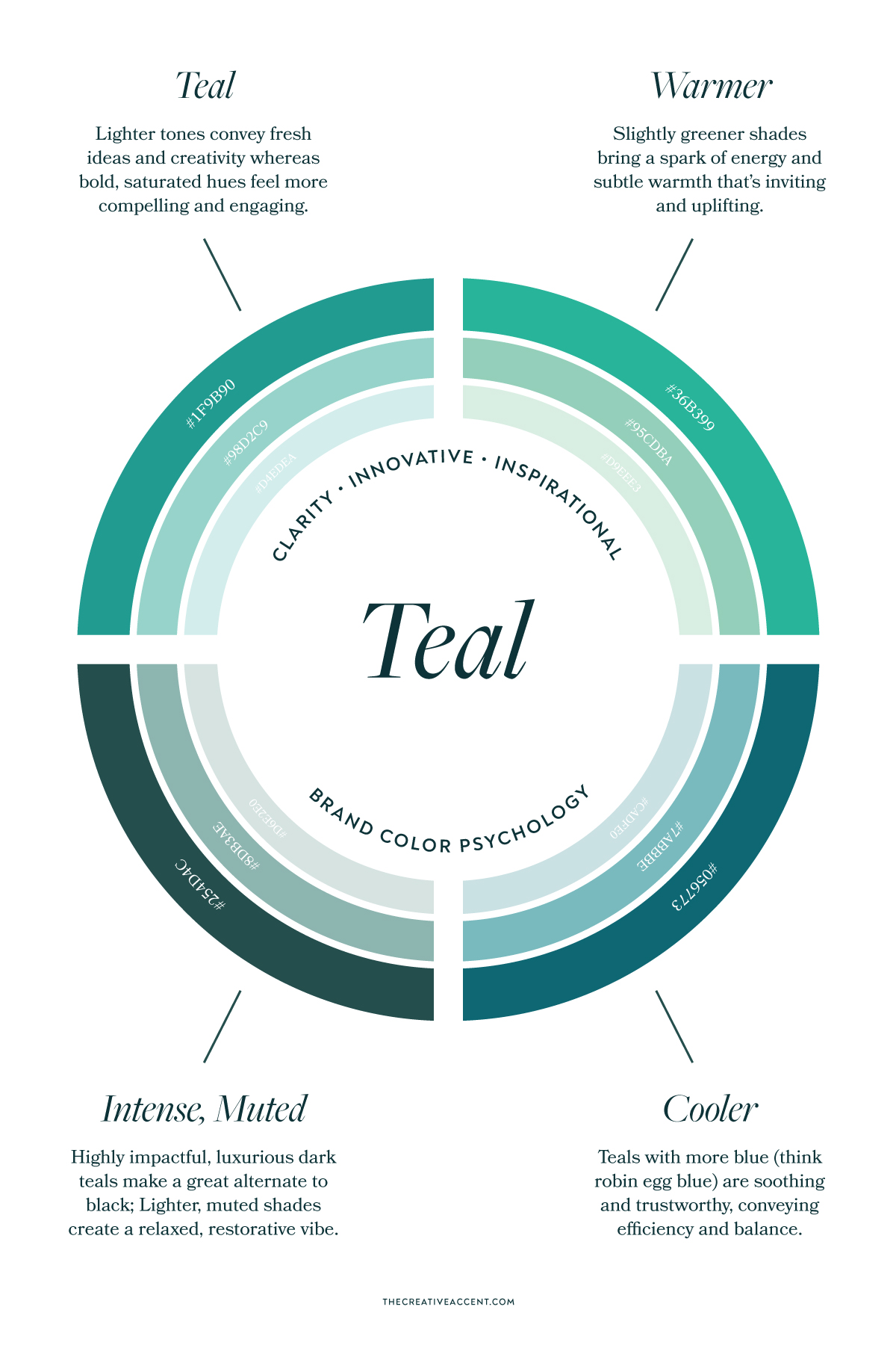
Teal
A mix of blue and green, this combination is often referred to as teal, turquoise, or aqua depending on its specific shade. Teal is a wonderfully uplifting color that implies clarity, innovation, and creativity. The blue undertones bring out a calming effect, while the presence of green conveys a subtle spark of energy. The diversity of this color can range from a vibrant turquoise which feels very modern and lively, to a darker, muted teal reminiscent of the sea.
Neutral Colors
Neutral tones are often used to fill out a color palette. From cool grays to warm browns, neutral colors have a stabilizing, grounding effect. When putting together a brand color palette, it’s important to include complementary light and dark tones for all the logical ways you’ll want to get your brand message across. For instance, a light background color is usually paired with a dark text color to enable enough contrast and easy reading. Many people default to pure black and white. However, this high contrast combination is not ideal for every brand and risks throwing off an otherwise harmonious color palette.
Black
Black is a strong color that conveys sophistication and prestige. This color is best for businesses that want to make an impact and have a taste for the dramatic. A bold color, black pairs best with other high contrast colors because it can easily overpower a softer, muted palette. If the strong characteristics of black aren’t right for your business, consider alternatives such as dark gray, brown, or navy blue.
Gray
Gray conveys some of the sophistication of black while feeling more relaxed and grounded. Light grays make a great addition to a cool color palette with a very refined, minimalist quality. A dark charcoal gray is a good color for body text as an alternative to pure black. Gray expressed as silver can bring a more glamorous, high-end quality to your brand when used appropriately. Overall, gray lacks energy though, so use cautiously if your brand is highly sociable and engaging.
Brown
A favorite among organic brands, brown has a natural down-to-earth quality that communicates modesty, stability, and heritage. As with all colors, brown comes in a variety of shades and tones. A dark chocolate brown comes across as strong and confident, while colors like terracotta and caramel are more energizing and extrovert. Soft browns like beige and tan make great complementary colors in a warm palette.
White
From a design perspective, white is technically a color and often finds its way into a brand palette inadvertently as a default background color. White is typically associated with cleanliness, purity, and simplicity. White and off-whites like cream help a brand feel light, airy, and elevated.
The importance of brand colors psychology and choosing the right colors for your business
Colors can communicate a whole array of emotions, which can either support your brand message or undermine it. Putting together a successful color palette for your brand demands an in-depth understanding of your business from a strategic approach. Essentially, this understanding stems from a strong Brand Strategy that outlines your foundation, the audience you serve, and your positioning.
Here at The Creative Accent, we’ve helped dozens of business owners like you choose intentional brand colors as part of our Signature Design Service. Starting with a strategy deep-dive, we help brands put together a cohesive color palette that resonates with who they are and who they serve. Learn more about our strategic brand design services here.


