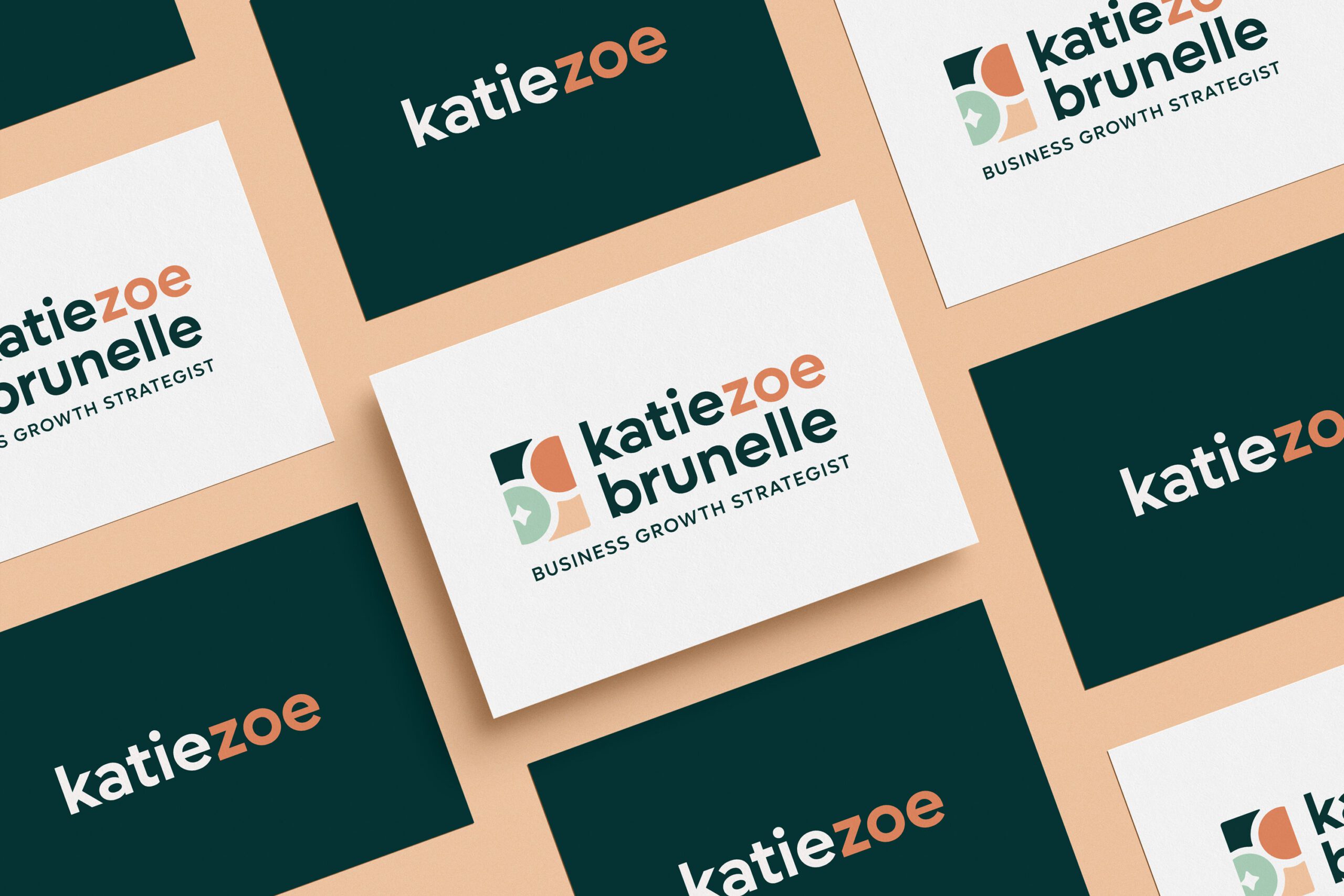
Case study: the logo and brand design for business growth strategist and consultant Katie Zoe
The Struggle – stuck in a rut on branding
When you find yourself too close to the project, sometimes you need to take a step back and get an outside opinion. With a background in communications, PR and marketing, Katie Zoe knows her stuff when it comes to helping other entrepreneurs grow their businesses. Yet, she felt blocked when it came to her own branding aesthetics. In her words:
I am so stuck on logos, colors, etc. and really want to move forward, loving how I’m presenting myself as a consultant.
Good design (just like business growth) starts with a strategy
Katie is certainly not alone in her struggle. As business owners, it’s easy to get lost in the weeds when it comes to our own branding. In order to find that necessary clarity to move forward, we started her custom design project with a brand strategy intensive.
During this 1:1 workshop, we uncovered several key qualities that set Katie Zoe apart. In particular, her rich marketing experience and gift as a natural listener, which enable her to connect with her clients and understand their needs on a deeper level. Her emphasis on balance and helping her clients choose business growth strategies that feel right to them also set her apart.
With these insights fresh in mind, I went to work on her new logo suite and collection of full brand design assets.

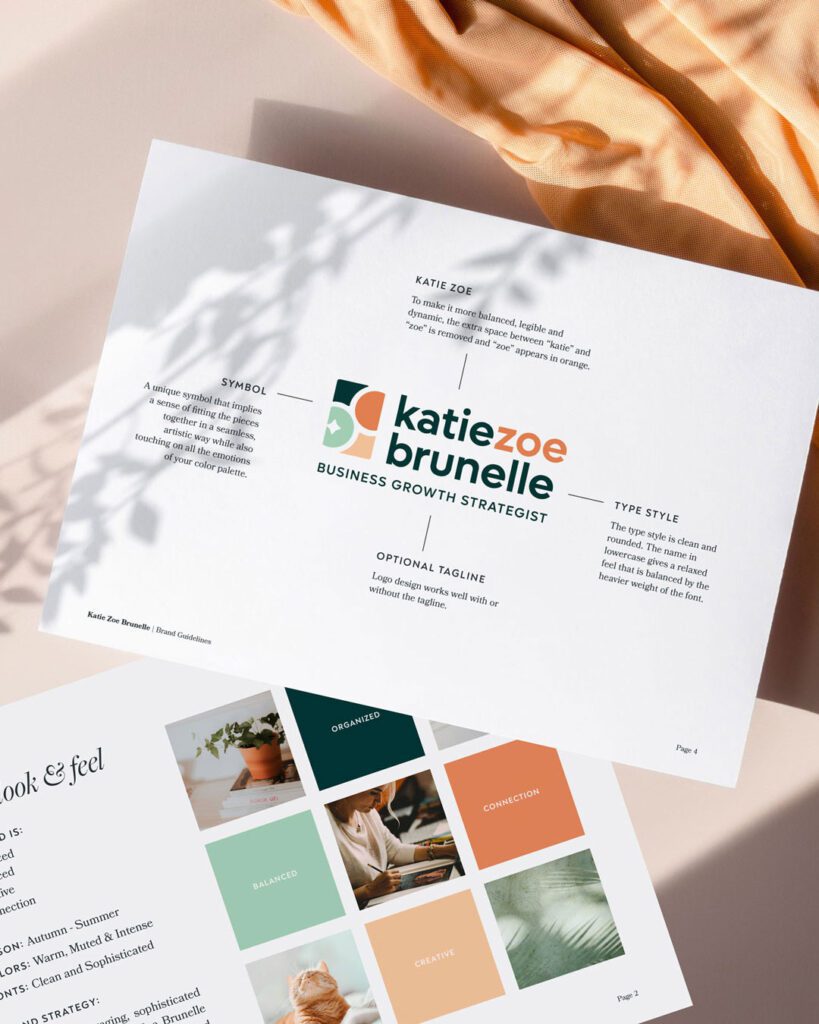
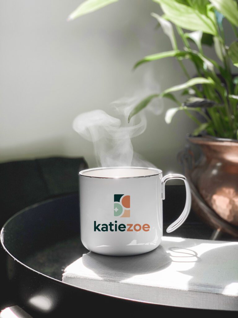
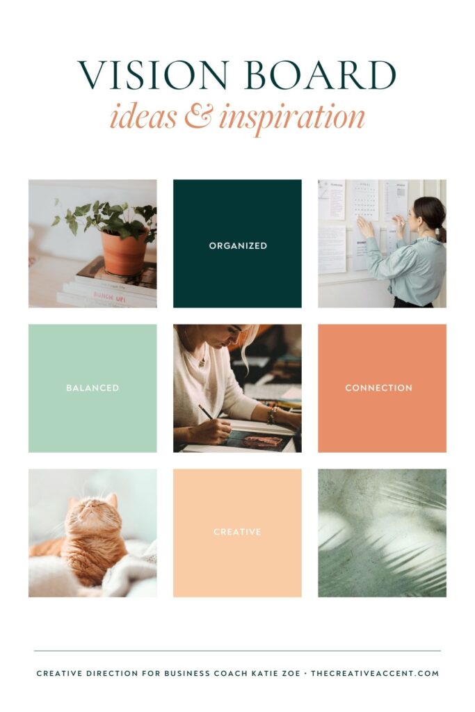
A look at the design strategy behind business growth strategies coach Katie Zoe
translating strategy into design
With her wealth of marketing experience, Katie already understood many of the key elements that go into brand strategy. She was familiar with brand archetypes and how to use different platforms to communicate her brand’s message. However, the road block came with how all that TRANSLATES into design.
For example, how do you design a brand that feels both playful and professional? How can you capture the role of a business growth strategist in a symbol without looking corporate?
Below is a breakdown of some of the design decisions for Katie Zoe:
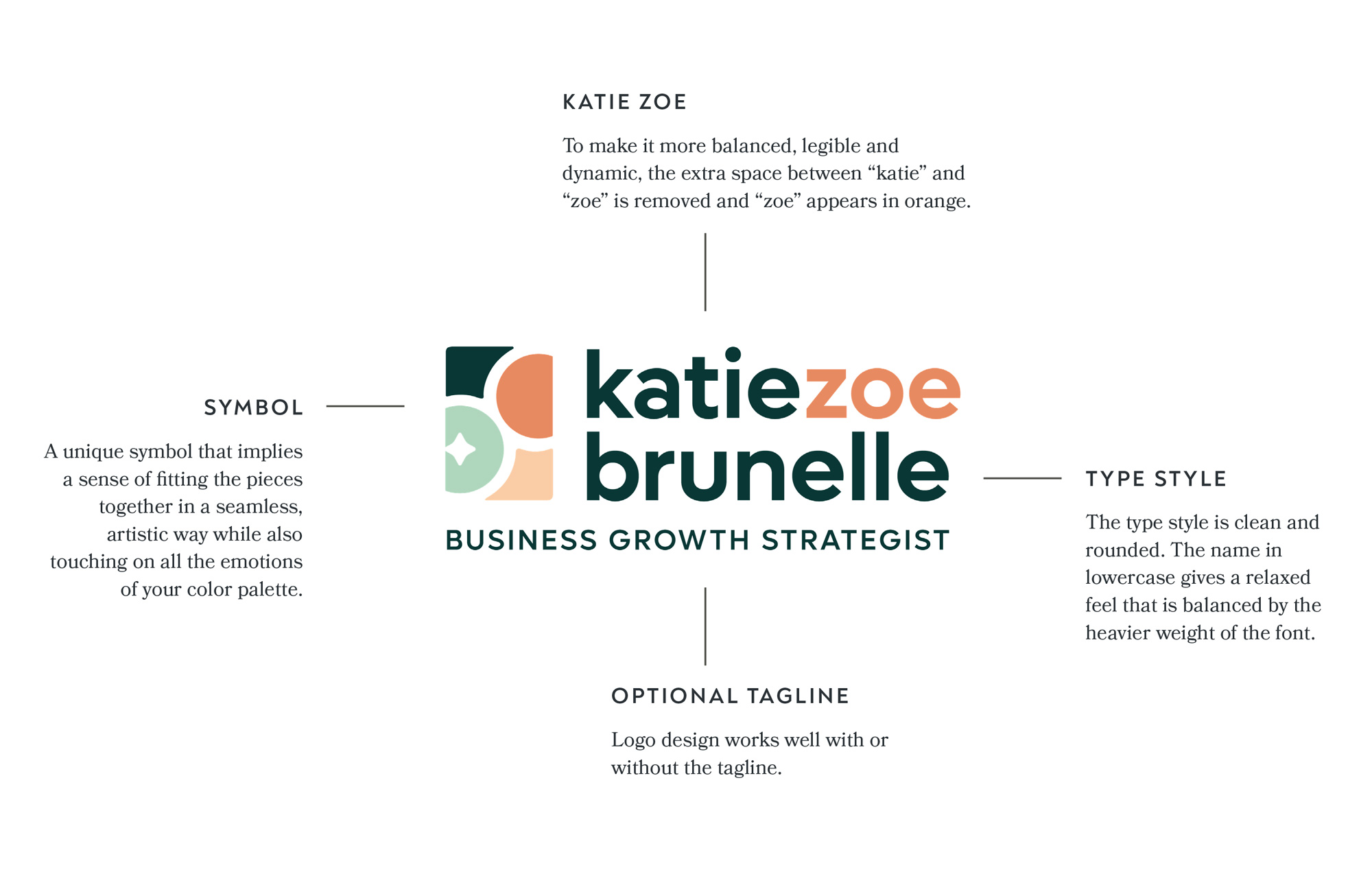
cohesive brand assets
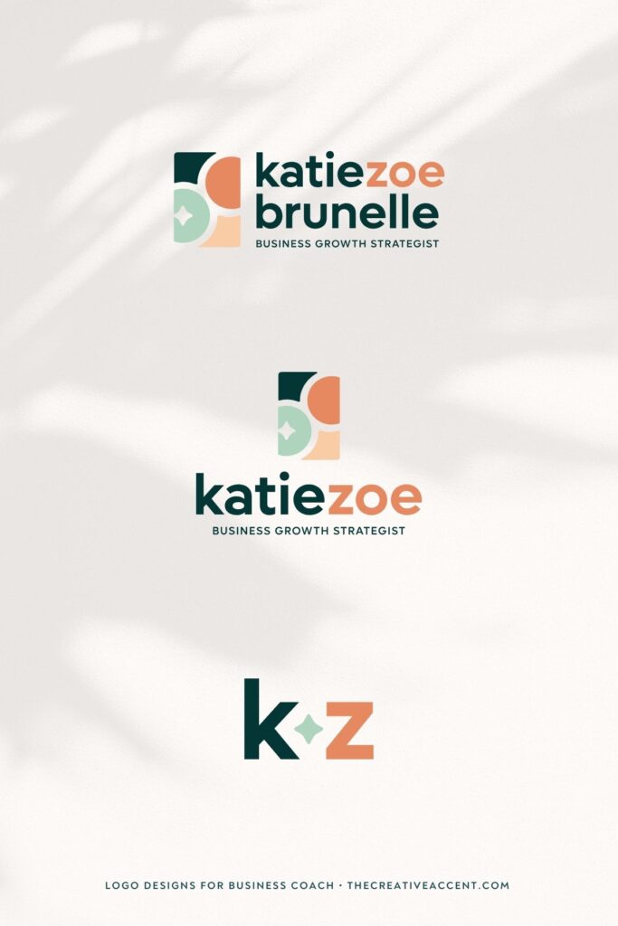
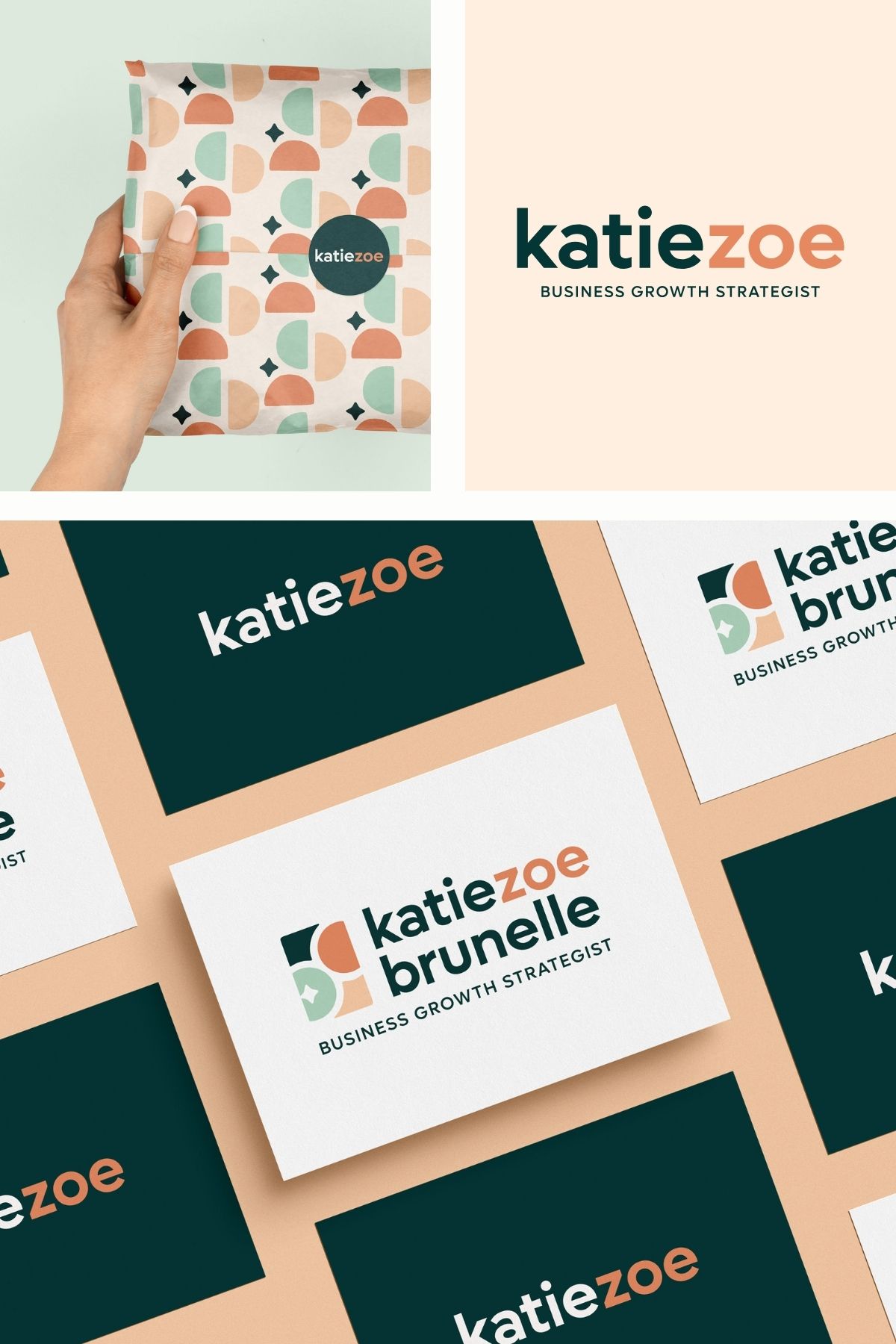
In our earliest communications, Katie mentioned needing help with “tying it all together”. There’s no point in expanding your marketing efforts if your branding isn’t built to function across multiple platforms and “grow with you”. That’s why my brand design services always include a logo suite (main, alternate, submark) that allows you to use your logo designs flexibly and creatively.
Additionally, a complete brand identity should also include essentials like an expanding color palette, typography hierarchy, patterns and any other elements that will help bring your brand to life across EVERY client touch point.
Below a brief overview of the brand design elements for Katie Zoe:
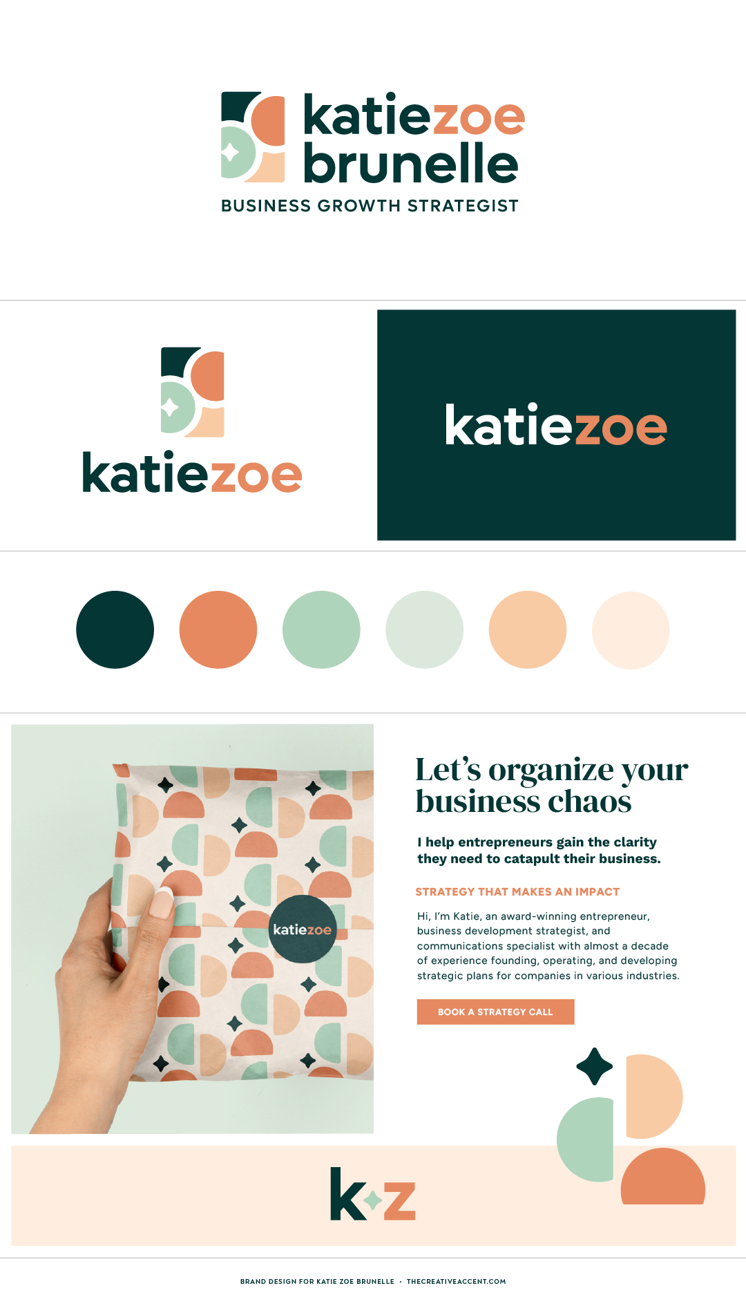
Differentiating through color
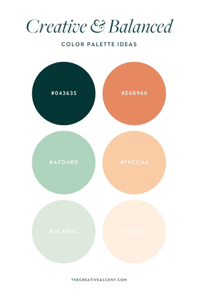
Choosing brand colors is a great way to set yourself apart from others in your industry. As we researched her competitors, it was clear that many of them were using bold, highly saturated colors. High saturation conveys high energy, which is fitting for business coaches and consultants.
However, Katie Zoe takes an empathetic, holistic approach that called for a softer touch. So choosing a slightly muted palette enabled her branding to better resonate with her personality and set her apart from competitors. The orange hues bring the necessary warmth and energy, while the greens evoke a sense of balance and reassurance.
Is my Signature Brand Design Experience right for your business?
Don’t let your business’s growth be held back by pieced-together design that doesn’t accurately reflect your brand. If you’re curious to learn more about my Signature Brand Design Experience and whether or not it’s right for you? Click here to get in touch!
