Logo design variations and creative ways to use them in your business
I can’t tell you the number of times I’ve heard a business owner say “I just need a logo design.” Before we dive into all the creative ways you can use logo design variations in your business, this MUST be clear: No business ever “just” needs a logo.
After all, a logo in isolation is just a pretty design with your business name in it. Only when it becomes part of an intentional branding STRATEGY does a logo start to make an impact for your business.
Even then, only one single design for your logo will soon leave you feeling incomplete. Let’s have a look at the most common logo variations you’ll need to keep your branding versatile and compelling across the many different ways potential clients can interact with your business.
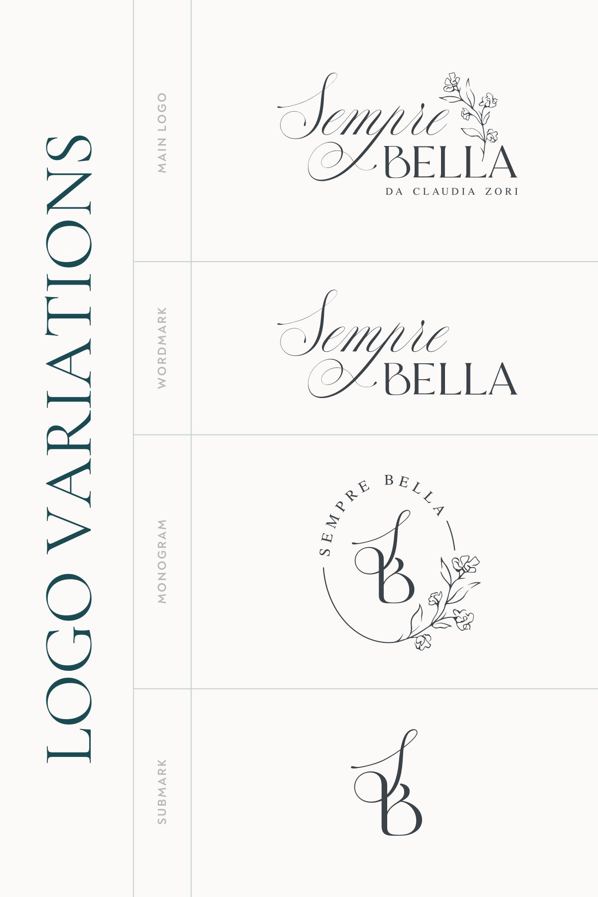
1 – the Main Logo
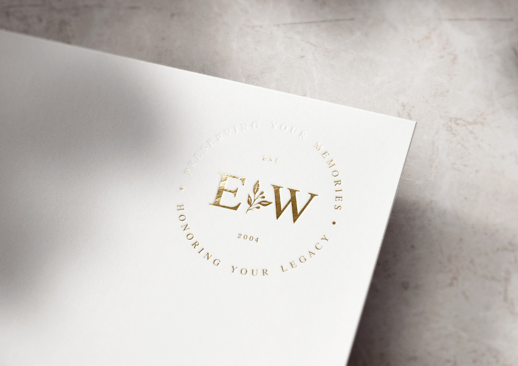
The main logo is the most complete version of your logo design, usually including your full business name, a tagline, submark (or symbol) and even the year established. Also referred to as your primary logo, you can think of the main logo as the most elaborate version to use for:
- business cards
- email signatures
- website header
- invoices and other administrative documents
- media kits, brochures, and presentation covers
- advertisements
2 – the Monogram
My personal favorite! The monogram is one type of alternate logo, usually a simplified version of your main logo design. The monogram logo incorporates your business initials in a creative, concise way and often includes the full business name or a tagline. Secondary logos like monograms work well for:
- packaging details like stickers and wax seals
- decorative watermarks on graphics and presentations
- website footers
- on apparel or other physical products
- square or round spaces, like social media profile pictures

3 – the Wordmark
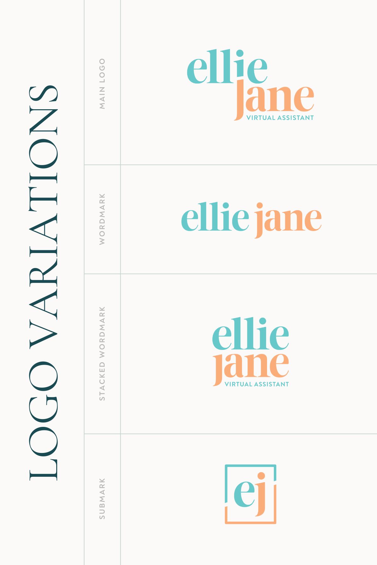
Another alternate (or secondary) logo style, the wordmark is a text-only version of the main logo. You’ll often find wordmarks in a stacked or horizontal layout, which may or may not differ from the primary logo design. Wordmarks are highly simplified, usually containing only your business name, and are great for:
- sticky website navigation headers
- email signatures or website footers
- smaller spaces that don’t accommodate the detail of your main logo
4 – the Logo Submark
The submark is the most simplified version of your logo design. It can be your initials, a small symbol, or a combination of both. Creative ways to use a submark in your branding include:
- as a decorative watermark on graphics and presentations
- as a favicon in your website browser
- on stickers and wax seals
- in very small spaces
Other logo design variations to have in your brand identity
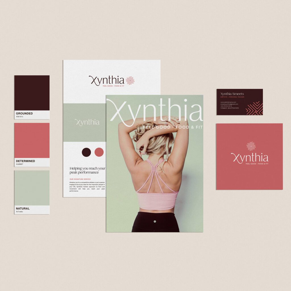
Establishing a cohesive brand identity that all works together seamlessly is essential for building recognition and trust toward your business. A big part of that is having complementary logo design variations that work together in harmony.
At a very minimum, you’ll want to have a main logo, a secondary version (monogram, wordmark or both), and a submark. But that’s not all.
Different color variations for your logo designs
For maximum versatility within your branding, you’ll also want to have all these logo files in different colors pulled from your brand color palette. For example, you’ll want each logo variation in:
- full color
- inverted full color (to use on a dark background)
- black (or the darkest in your color palette)
- white (or the lightest in your color palette)
- one-color versions in your primary brand colors
If you’re curious about which file types you need for print and web use, see my other blog post: The Ultimate Guide to Branding for Your Business.
Why logo variations matter for your business
These days, potential clients have many touch points where they may interact with your brand, from your website and social media presence to your business cards and more. Having a variety of logo design variations creates a well-rounded branding experience that feels intentional and professional.
For example, a more detailed primary logo will not look great condensed down as an Instagram profile picture, but this is where a monogram or submark will shine! In the same way, a less detailed submark will tell an incomplete story on the front of your business card.
With so many ways for clients to interact with your brand, it’s only logical to have a full set of brand assets to accommodate all these touch points.
Hobbies have a logo. Serious businesses have a brand strategy!
“I just need a logo” will quickly turn into “my brand feels all over the place!” Why? Because this route is devoid of an intentional strategy that has long-term success in mind.
It inevitably means piecing together the other crucial elements that make up a complete brand identity, such as your color palette, type hierarchy, messaging strategy, and overall brand positioning.
Save yourself the frustration and DIY overwhelm by investing in strategic brand design right from the start. Your long-term business goals will thank you!
